Maps & visualisations
Now we will cover the most rewarding stage of data analysis – creating visualisations to engage our audience. Without a compelling visual statement, we risk that our tedious work on data processing and analysis might not be recognised by the public.
There are many great resources online to help you learn the basics of visualisation. If you are wondering which chart fits your data best, use the From data to Viz guide.
1. Dataviz fundamentals
Let’s start with the basics of visualisation and the simplest charts you can create in DataWrapper. First, you will learn how to publish online a fully interactive and searchable table with your data. Then we will experiment with different versions of a bar chart, which is the most universal form of displaying survey results.
We will visualise selected data from the audience survey of community centres in Katowice conducted by Medialab Katowice in 2019.
◕ Create an online table
- Inside DataWrapper select [ + New Chart ]
- Copy-paste the CSV data below
- Follow the steps to design and publish your table
branch,address,www
Ligota,Franciszkańska 33,mdkligota.pl
Piotrowice,Generała Jankego 136,mdkpoludnie.com
Murcki,Pawła Kołodzieja 42,mdkpoludnie.com
Zarzecze,Pawła Stellera 4,mdkpoludnie.com
Podlesie,Sołtysia 25,mdkpoludnie.com
Kostuchna,Tadeusza Boya-żeleńskiego 83,mdkpoludnie.com
Koszutka,Michała Grażyńskiego 47,mdkkoszutka.pl
Dąb,Krzyżowa 1,mdkkoszutka.pl
Bogucice,Markiefki 44a,mdkbogucice-zawodzie.pl
Zawodzie,Marcinkowskiego 13a,mdkbogucice-zawodzie.pl
Szopienice-Hallera,Hallera 28,mdk.katowice.pl
Szopienice-Westerplatte,Obr. Westerplatte 10,mdk.katowice.pl
Giszowiec,"Plac Pod Lipami 1, 3-3a",mdk.katowice.pl
◕ Create a bar chart
The survey participants declared how often they visit community centres – we will use this percentage data sample to create simple visualisations.
- Inside DataWrapper select [ + New Chart ]
- Copy-paste the CSV data below
- Follow the steps to design and publish your chart
frequency,ratio
once a week,57.9
once a month,22.3
less often,13.5
first time,6.4
◕ Extend the previous visualisation to create a grouped bar chart
The frequency of visits to community centres varies from place to place. It is not surprising that people living in the neighbourhood attend events more often.
- Inside DataWrapper select [ + New Chart ]
- Copy-paste the CSV data below
- Follow the steps to design and publish your chart
frequency,living outside,living nearby
once a week,48.5,61.7
once a month,20.2,23.1
less often,17.3,11.9
first time,14,3.3
◕ Experiment with other charts
You can also try other availabale types of charts for the same data. Can you find a better way to visualise it than bars? What do you think about the readability of the donut chart below?
2. Dataviz workflow in a nutshell
Now that you have explored the various data formats and methods of data processing and visualisation, are you ready to implement a data-based micro project? In this exercise, you will perform several key data analysts’ activities to complete step by step the full workflow – from data acquisition to visualization on a map.
Let’s assume that we want to visualise the number of recipients of municipal community centres by Katowice’s districts. We are primarily interested in where the residents are most likely to participate in the events. To make a comparison, we need to normalise the data, taking into account the number of inhabitants in the districts.
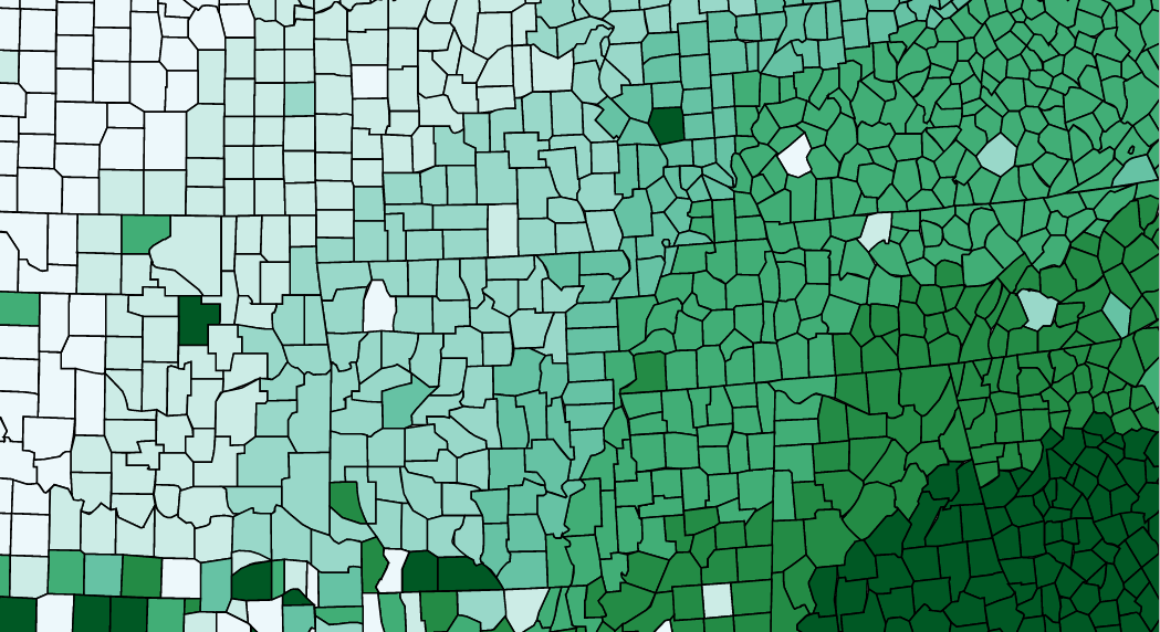
This is an example of what such a visualization could look like.
◕ Find and prepare the right data set
- Go to Katowice Open Data repository and find a relevant data set (Katowice population in districts)
- Create a new sheet with two columns:
district, population– this will be our dictionary (lookup table), which we will combine with the survey results.
PRO TIP: Using the API, you could narrow your search to the data you are most interested in, which is the current total number of district residents (API query). Once you have the response in a JSON format, you can convert it to CSV.
◕ Count the participants number for each district.
- Select [ ▾ File ] » Import » Upload the CSV file » Append to current sheet
- Select [ ▾ Data ] » Slicer » From address_city filter out values other than
Katowice - Select [ ▾ Data ] » Pivot table to count the values from
address_districtcolumn » Copy the result - Create new sheet » [ ▾ Data ] Paste special » Paste values only
◕ Compare the number of participants with the population in each district.
- Use
=VLOOKUPformula to match district names to the lookup table created earlier, store the results in a new column. - Measure the number of participants per 1000 inhabitants for each district
- Create a new table with
district, participants, population, participants_per_1000» Check if the number of rows matches the number of Katowice districts » Export table to CSV file
◕ Start visualising data on the map!
- We already have our data set, but what about the spatial data? We can reuse the GeoJSON file from previous exercises. You can also find it in the online data repository.
- What kind of visualisation would work best for this case?
- Inside DataWrapper select [ ▾ New Map ] » Choropleth Map » [ Upload Map ] » [ Next ]
- From [ ▾ Geo-Code ] select
name» and [ Import your dataset ] » Proceed - Redesign your map
◕ Experiment with the color scale
The right choice of color scale is one of the key steps when designing map visualisations. To be honest, if you’re not a graphic designer, don’t waste time on manual color selection – use one of the tools that offer ready-made and carefully designed options, for example ColorBrewer. But don’t blindly trust automatic tools. Each time check in practice, preferably on the prototype visualisation, whether the chosen colors match your data. You can always choose a different set or slightly correct the proposed solutions.
You can also use w3schools’ or Adobe’s html color pickers.